Clear
As it should be.
Challenge: Create a bottled water brand named “Clear”. Using only the name of this brand, we had to create a full identity package for this new product. Clear had to be in a position to enter the marketplace for high end bottled water, competing against brands such as Fiji and Voss.

Team members: Nicole Haskel, Isabella Vallefuoco, Tram Vo, Kayla Wolff, Lindsay Haimm, and Dani Artola
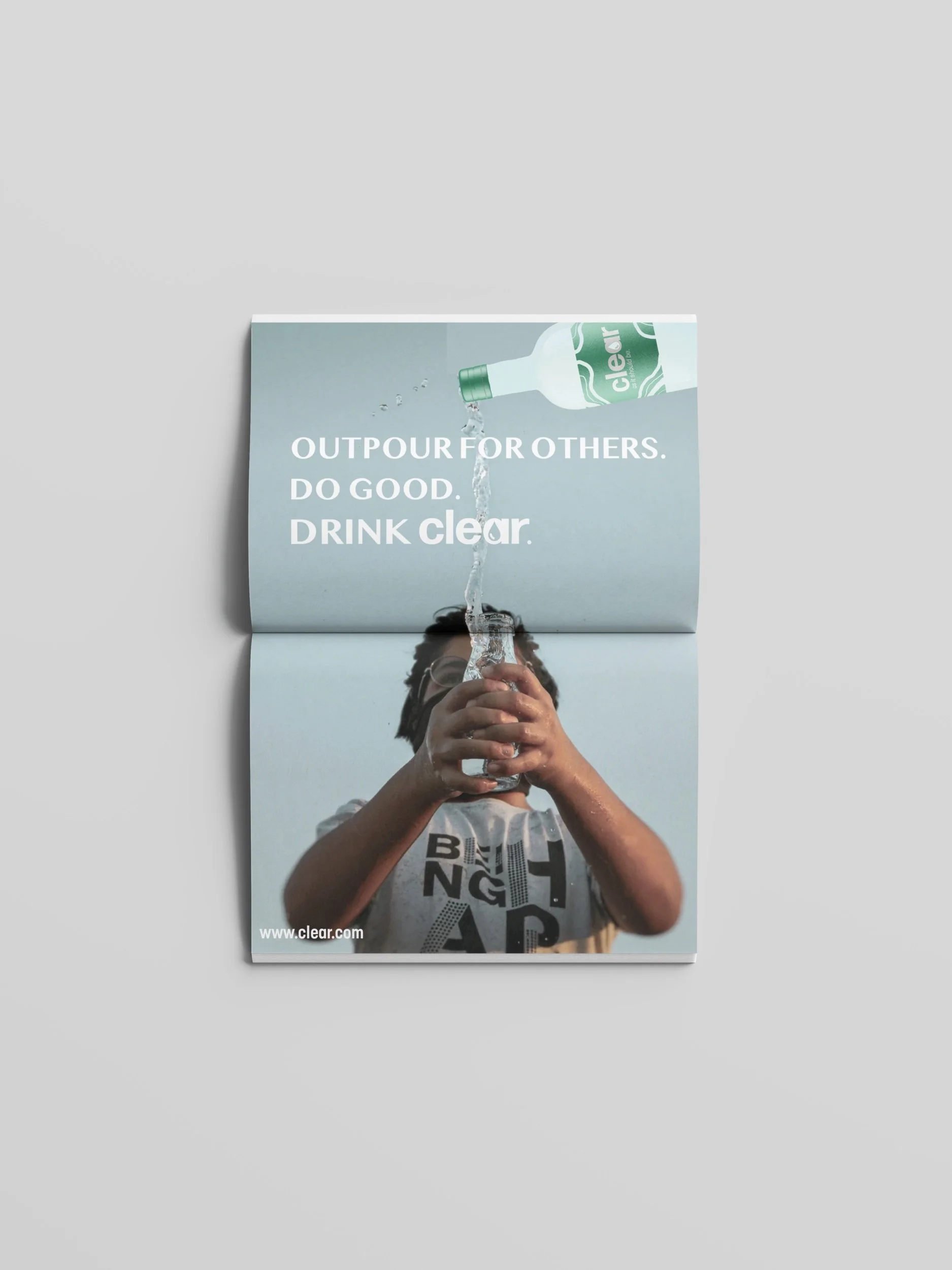
My Role: Created logo, packaging, advertisements and brand promise.

Awarded first place in a class competition against five other agencies!
Design Process
For the logo I wanted to play with the idea of using negative space and transparency. Through this we were able to create a logo that made the shape of a water drop in a powerful but subtle way. The negative space making the water drop aligns with the name of the brand “clear” as it appears see-through. For the logotype, I emphasized the water droplet with bold outlines and a transparent center.
As for the color palette, I decided to be a bit non-traditional by using a green instead of a typical blue for bottled water packaging. Green appeals to our target audience as research states it symbolizes health and wealth. Green is easy on the eyes and creates balance and relaxation in the design. Green is also an indicator of new beginnings which will help transition us into our brand promise.
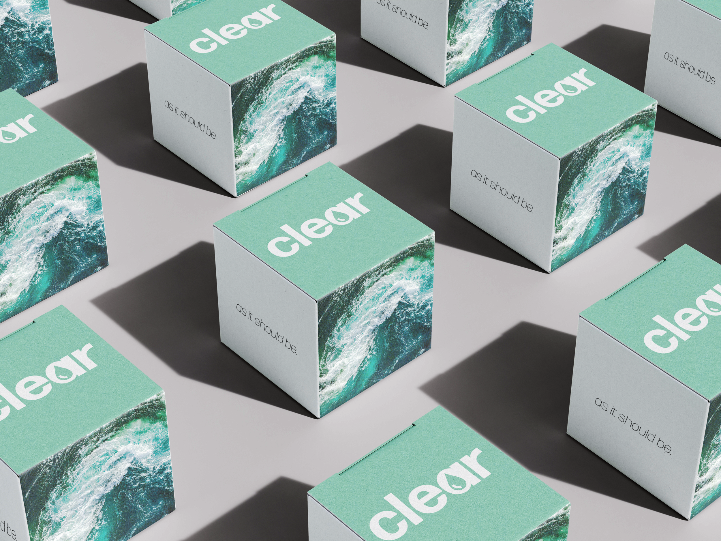
For the packaging, I was inspired by the natural flows of water and its simplistic elegance. I wanted to choose a bottle that was pleasantly unexpected, drawing inspiration from high-status wine packaging. Utilizing glass materials for our bottle is not only eco friendly but adds a touch of sophistication. Sleek design and thoughtful use of color draw the customer in and portray a high-end product. I also streamlined our packaging for selling packs of bottled water.


