

The Power of Graphic Design.
The Diamondback Instagram Rebranding Campaign


The Study
In today’s society, conveying a clear and consistent brand is vital to establishing a successful company. Having a recognizable brand helps to propel the success of marketing campaigns and reach a wider audience. With the pandemic, it is more important than ever to have a brand identity present on social media platforms. Specifically, Instagram helps to increase engagement among younger audiences, as one of the top social media apps.
Our marketing team saw discrepancies across The Diamondback’s channel, with no clear brand identity. There was a lack of uniformity in terms of color palette, there was no clear mission statement, and target audiences remained unidentified.
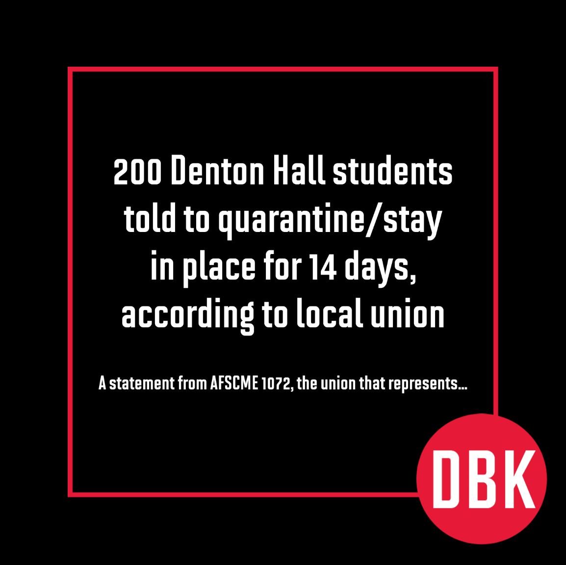
In terms of The Diamondback’s Instagram, there were some improvements to be made. The grid layout had many posts that were solid black blocks directly touching one another. These black grid posts attracted the viewer’s attention to focus on only that specific portion of the grid. We wanted the viewer’s eyes to move across our grid content and be interested enough to click on posts to read more. The grid photos also had vastly different lighting, creating a mixed feel. The posts were not planned with the impact on the grid layout in mind.
Another issue was that the target audience was not specified. The engagement news team was trying to mimic news Instagrams such as the Washington Post, using black and white posts with The Diamondback red color. However, unlike the Washington Post, most of The Diamondback’s readers are college students and not in the working world. The Diamondback Instagram needed to be more eye catching and fun to engage its younger audience.
Instagram Grid Prior to Project Start
The Solution
In the past, collaboration across The Diamondback’s departments was limited. In general, teams worked exclusively on their own assignments. Our team decided to take down this boarder and open up more communication. We discussed the lack of brand consistency and worked with the engagement news team to establish how they wanted The Diamondback to be perceived.
Moving forward, we decided to tackle The Diamondback’s presence on Instagram first. I took on the role of a design lead for this project. I created a mockup Instagram grid proposal as well as story highlight icons that could be utilized to increase user engagement.
In my grid proposal, I aimed to increase consistency and flow. Each post was carefully constructed to complement the surrounding posts and to align with the grid theme, while still introducing new, unique features (with grid posts looking the same in the past, users would overlook new posts on the feed thinking they already saw the post). I made sure the photographs all had consistent lighting by creating a filter so that The Diamondback’s updates would be recognizable. The filter created dimmed down the photos to convey a more serious and professional feel, contrasting the more lighthearted bright red designs. I also ensured that each post was branded, giving credit to The Diamondback.
We are currently in the process of implementing some of these new instagram post templates and will alter the designs with constructive feedback by the news team in mind.
My Instagram Grid Proposal

Diamondback Instagram
Branding Presentation
Our team created an Instagram branding presentation to showcase to the engagement news team. Overall, the news team was very responsive they loved my designs and our plans to revamp our instagram presence.
Developed in collaboration with DBK Marketing Team members:
Camryn Morris, Jonah Lecker, Luke Jackson and Saran Kaur
Camryn Morris: Conducted market research and managed the project
Jonah Lecker: Compiled all materials to form comprehensive presentation
Luke Jackson: Reviewed and edited all documentation
Saran Kaur: Proposed brand color palate and second photo-based grid design